|
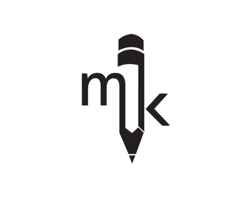
This is the personal logo for illustrator and designer, Marshal Kiganjo. The artists initials are clearly legible whilst the pencil design clearly hints at his creative side. I think the design is simple yet effective.
|
|
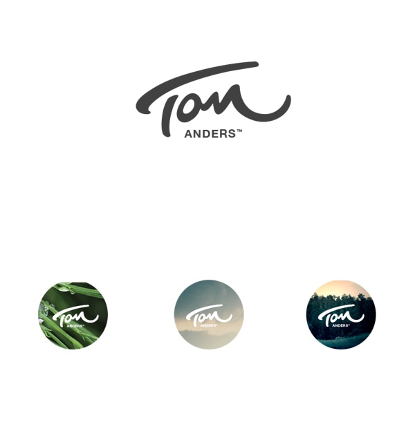
This is the personal logo for creative/art director Tom Anders. I like the constrast between the clean san serif type used for his surname and the more expressive type used for his first name. The designs simplicity means is can be used against a variety of backgrounds and blend in well. The 'm' at the end of 'Tom' resembles an 'n' which could possibly cause some confusion, I think legibilty would be important for someone promoting their name.
|
|
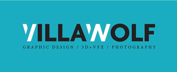
This logo is for graphic designer and photographer, Pepe Villalobos. Villalobos has chosen to use the name 'Villawolf' to promote himself which shows some originality. I like the bold, clean san serif used for the name and think the 'V' and 'W' stand out with their slightly distinctive design and colour. I think this also allows for the logo to be shortented to just 'VW' if needed. I'm not a fan of the small print underneath however as I feel it crowds the logo.
|
Example Logos Of Creative Practitioners
All logos were collected from:
https://www.webpagefx.com/blog/web-design/great-examples-personal-logos-branding/
https://www.webpagefx.com/blog/web-design/great-examples-personal-logos-branding/
