|
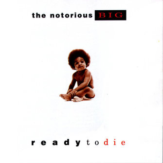
This is the cover for hip hop artists Biggie Small's posthumous album. The use of white space is particularly effective: tunneling your attention to the baby in the middle. The image of a baby symbolizing birth is in stark contrast to the album title which refers to death. I quite like the use of a bold, modern san serif, as it works well with the minimalist, modern feel. I also think the serif "to die" contrasts well with the more prominent font, whilst the addition of red singles out the "die" giving it more impact and perhaps hinting at the artists fate. I am not however to keen on the wide tracking used on the bottom line of type. I think that if the tracking was consisten throughout the album cover their would be more of a sense of unity throughout the various elements of the cover.
|
|
|
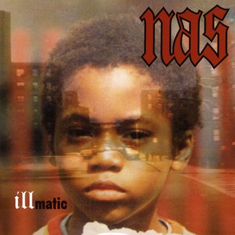
Nas' Illmatic contains music that reflects the artists upringing surrounded by crime, death and chaos in a poor housing project in New York. By superimposing a young Nas's photo over a photo of the projects he grew up in, Aimee Macauley perfectly captures the idea that the artist embodies his childhood environment. By using an earlier photo of Nas as a child, and making him slightly opaque as to allow the background through, the design hints that the surroundings become part of him. I find the the use of a blackletter typeface to be particularly suitable as it reinforces the edgy, dark contents that are prominent within Nas's lyrics. In addition the size and placement of the artists name is clever as the viewer is drawn to the type from the subject.
|
|
|
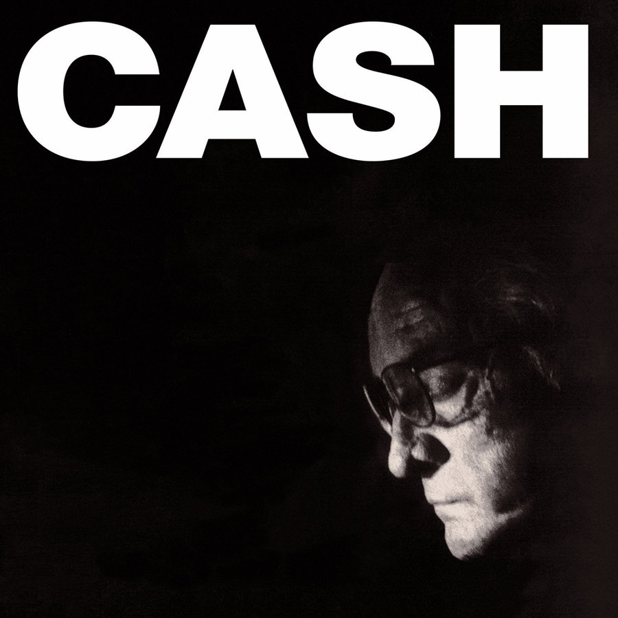
Johnny Cash's last album was very sombre and dark. The album cover does well to reflect these emotions. The overshadowed portrait photograph of Cash is very subtle and is almost hidden, however the expression on his face really expresses the overall feel of the album. The large, Bold, San serif typeface commands your attention, further drawing you away from Cash's face. By sticking to a black and white colour scheme, the cover provides no distractions from the two main elements, the type and the portrait. On an extra note, I like how the placement of the type and image make it seems like the type is providing light onto Cash's face; clever.
|
|
|
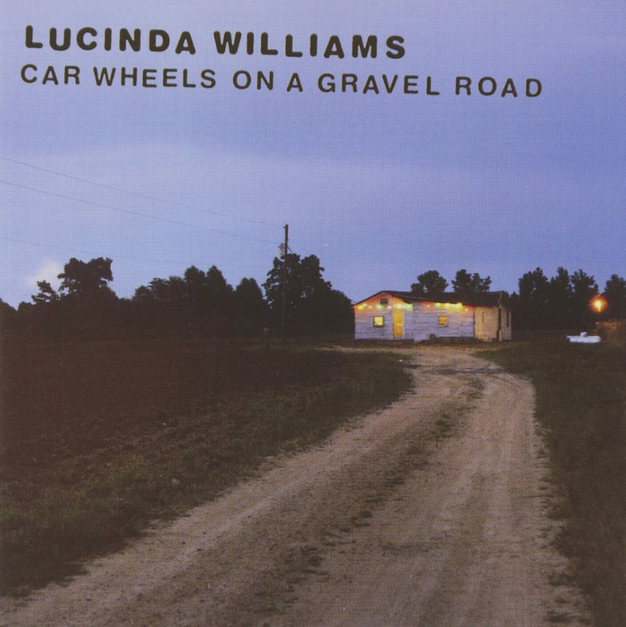
By using a photograph of a landscape featuring a gravel road, this cover imagery links directly to the title of the album. The greenery, the dirt road, the wooden house all against a classical American country backdrop. The imagery is a fitting embodiment of the American countryside and country music. The type also works well against the blue of the sky with the dark tone complementing the dark, shadowed trees. I also think the slight slant of the type gives the design humility as it hints at imperfection and improvisation which features heavily within country music.
|
|
|
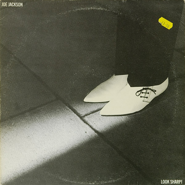
This cover for Joe Jackson's 'Look Sharp!' album features a very creative photograph accentuated by a very clean San serif typeface used for both the album title and the artists name. The photo dominates most of the cover, with the bright white shoes particularly eye catching against the darker background. The trail of light 'coming from the shoe' guides the eyes towards the 'Sharp' looking shoes, a reference to the album title. The placement of the type at opposite corners of the cover does well to complete the composition and frame the image.
|
|
